wesleysheng.com
2025
About
This was a full personal redesign of my own personal website. While the previous iteration of this website was servicable, the intent was to create an experience that made use of current design practices and technologies.
This page is here to document the creation process and to discuss the technologies used to create it.
The site is continously evolving as time goes on, so some details described below may not be up to date.
Background
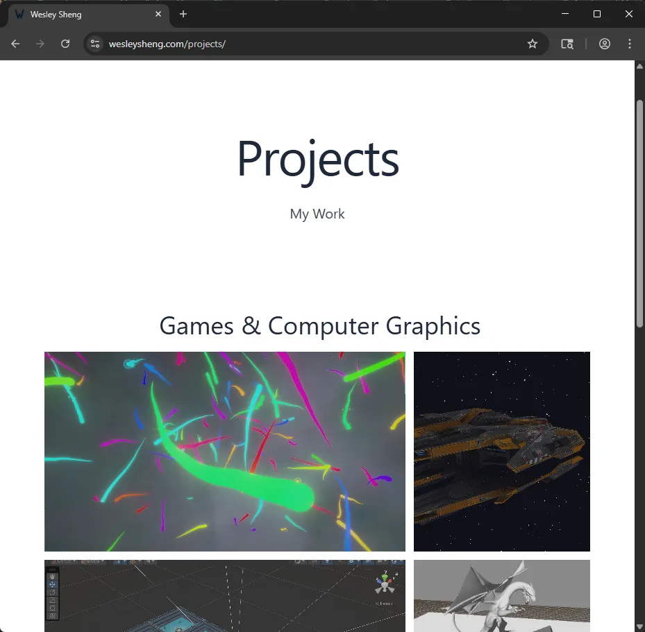
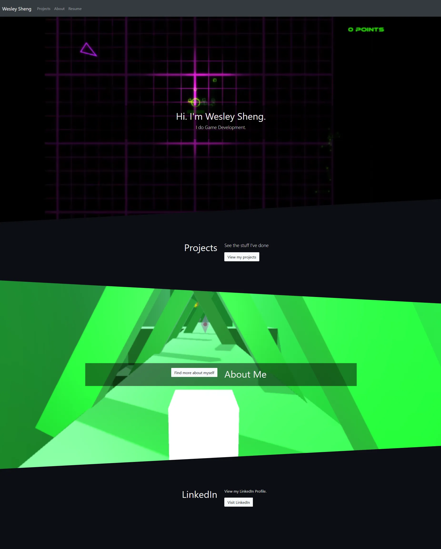
The 2018 Site Design
The first version of this website was initially created and published around 2018, using HarpJS to generate static pages, supported by Bootstrap (a CSS framework which supports mobile-first design) and JQuery. The site was conceptualized behind “dynamism”: A video that played in the background, and sections were seperated with an angled motif. Meanwhile, projects were displayed using rectangle cards. Screenshots of both the original homepage and projects page can be seen below.
At the time that the website was written, it was both functional and supported some modular elements. However, several of the libraries and tools used had a risk of being bloated, and code functionality was limited from dynamically and conditionally generating pages and content.
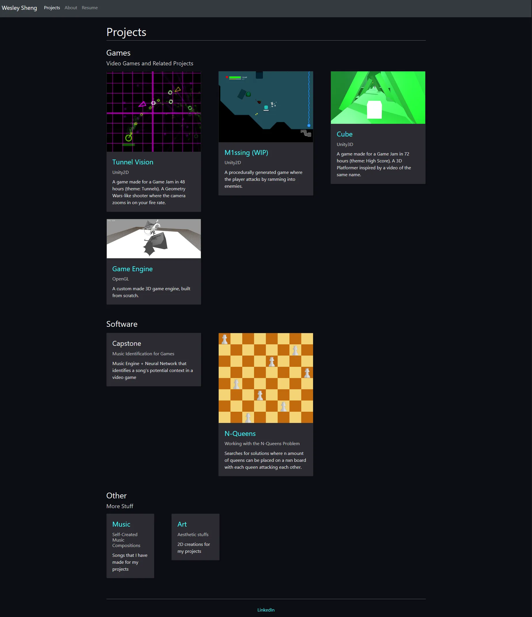
The 2022 Site Design
The code architecture received a refresh in 2022, with a switch to Astro. The webpage design remained mostly the same, albeit with some simplifications in the site design. Bootstrap was replaced by Bulma, which is more lightweight and makes no use of JavaScript. While JQuery provides helpful utilities, it was also ultimately dropped in this iteration to help reduce memory usage.
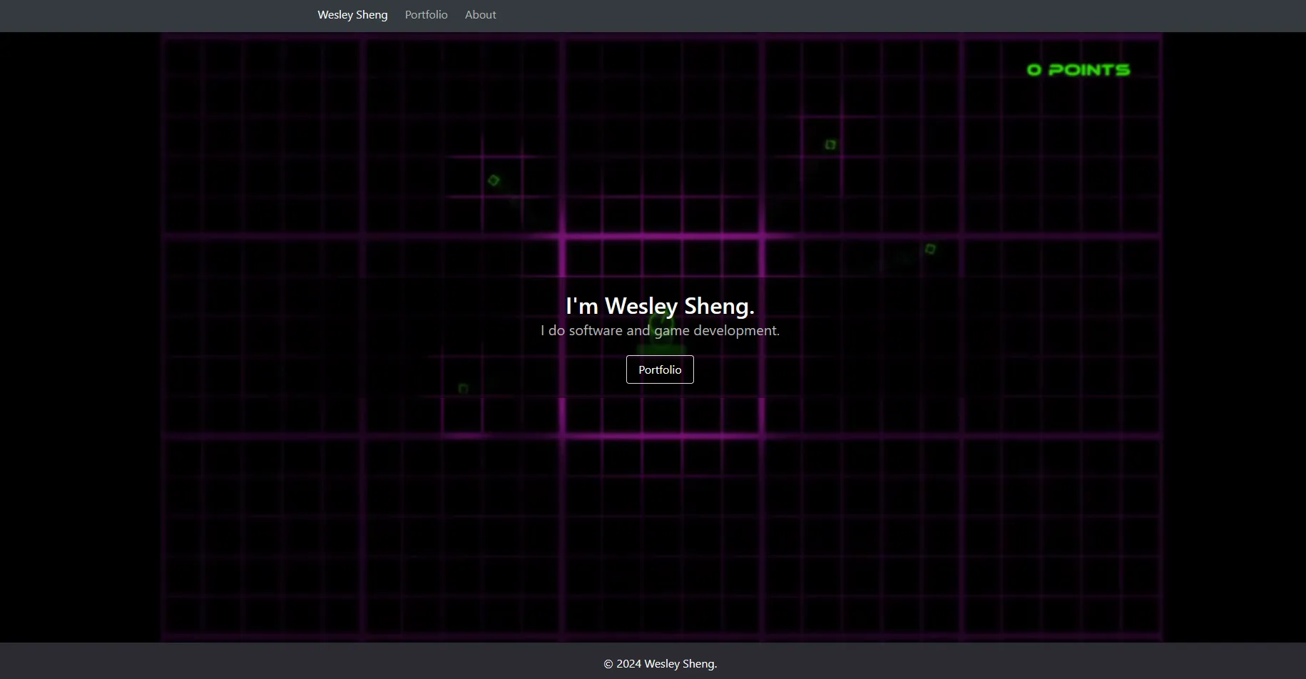
In 2024, informal surveys and feedback on the 2022 design was gathered:
- Visitors could not view key projects from the home page.
- Project cards were not of uniform height.
- The About page was out of the way of the main content.
This feedback eventually led to the desire to redesign and create a new personal website.
Project Restrictions
As part of the full site redesign, there were several constraints that I had to be kept aware of.
The most important restriction was that financial costs were to be kept to a minimum. This meant minimizing the reliance of paid reoccurring services, which had the risk of accumulating expenses. The only financial cost for this project is domain registration and renewal.
I also intended this project be a simple yet modern webpage. While presentability and responsiveness was of high priority, it was also important to keep the website data footprint as small as possible.
Lastly, this was a project in which I wanted full control over the website design while maintaining modularity. While various web-based technologies was used for this project (see below), there was no outsourcing or WYSIWYG builders was used in the creation of this site. In addition, I wanted to leave room for modularity such that new projects and sections could easily be added to the website.
Tech Stack
Some of the technologies used to build this website include:
- Node.JS - Runtime environment for web development that includes the NPM package manager.
- Astro - Web framework.
- Tailwind CSS - Utility-first web styling framework.
- AOS - Animate on scroll library.
- Three.JS - 3D rendering library.
- Howler.JS - Audio library.
- TypeScript - Strongly-typed language that transpiles into JavaScript.
- Cloudflare - Content delivery network (CDN) service that offers web deployment, web storage services, and security. In addition, offers a web-hosting service.
- git - Used for version control.
Astro had been used in a rebuild of my site in 2022, and I found it both flexible and modular. The ability to create project descriptions using Markdown is powerful and allows for the adding of new projects without code overhead. Astro is a multi-page application framework, which differs from single-page application frameworks such as React and Vue in that JavaScript usage can remain minimal, which can help reduce memory usage for rendering pages (regardless, Astro itself supports using React and Vue components, so it’s also possible to use both approaches).
Tailwind CSS, used for styling is a new framework employed for this project. It’s greatest advantage is that allows for quick prototyping and iteration while still allowing for a fully personalized theme. It is also effective for only including used CSS styles in the output, which help reduce the overall website data footprint. Bulma CSS had been used for previous iterations of the website, which was serviceable and contained a small footprint compared to other CSS frameworks available. Nonetheless, the customizability of Bulma components is fairly limited, and thus I opted for Tailwind CSS.
While Cloudflare is primarily used to create static builds and to host this website, Cloudflare also offers security-based features to help mitigate abuse. In addition, Cloudflare’s R2 object storage is used to host audio files.
Site Architecture
Astro uses an Island Architecture which combines individually created web components to create a full webpage and site. Aspects such as the header, footer, and page elements all have their own components.
The project is set up with the following folder structure:
- assets: Contains files hosted directly on Cloudflare. Not included in builds.
- dist: The site output. This is the content that actually gets published online.
- public: Asset files that are directly copied into the
distfolder. These are stored within the git repository. - src: Source files.
- assets: Asset files that are compressed and optimized by Astro.
- components: Contains reusable webpage elements.
- data: Has Markdown files and .json data files that other Astro files depend on.
- layouts: Page templates, which
pagesinsert themselves into. - pages: Astro files that also correspond to page routes.
- styles: Contains Cascading StyleSheet files.
- utilities: Helper programs and tools to make development easier.
Pages
Home Page
The home page contains content that most users will see when they first arrive on the website. The main objective in this instance was to be as direct as possible, and to say as little as possible. The “I do…” tagline was retained from previous iterations of the website, as I strongly believe in getting to the point as quickly as possible.
Projects
Showcasing projects on this website has multiple steps:
- Create and write the Markdown file for each project. Each file corresponds to a page.
- Use Astro’s Content Collections to generate a list of project files.
- Generate routes for each project page.
- Apply custom styling using Tailwind’s Typography plugin.
- Render the final page.
Each project Markdown has its own frontmatter containing properties of the page. Here is the frontmatter of this page:
---
title: wesleysheng.com
date: May 15, 2025
thumbnail: "./img/website.png"
thumbnailAlt: "A screenshot of the home page of this website, displaying header text."
highlight: false
draft: false
---- title: The webpage title.
- date: The date that the project was created.
- thumbnail: A url to the image used for the project preview and project header.
- thumbnailAlt: Alternative text describing the image.
- highlight: Configures whether this project shows up on the home page.
- draft: Determines whether the page is visible or not.
All projects are stored in subfolders, which allows for the creation of multiple categories of items.
Audio Player
The audio player found on the music page of this site makes use of Howler.JS as a backend, but it does not supply an audio player to use. As a result, a custom audio player was built to make use of Howler.JS’s features.
Since audio files tend to be larger in size compared to both text-based formats and images, cloud bucket storage is used to store and keep files. Git LTS was not used as the storage would conflict with the storage limit of other projects.
To help keep track of the audio files shared on this website, a custom Python script discovers audio files from a local assets folder and generates a .json file, containing information such as composition year, song name, url, and a description.
Just like for each individual project, the music page also renders Markdown content.
Background
The background seen throughout the site uses Three.JS to render WebGL, and 3D content. It was made to be as minimal and unobtrusive as possible, while still allowing for showcasing realtime 3D on the site.
To render the content, the site first creates a grid of 200 by 200 points (vertices) and connects them with line segments via indices.
As the user scrolls through a page, the percentage of scroll progress is used to linearly interpolate the camera and grid. It also affects the grid’s amplitude, so the movement effect isn’t as pronounced when the user is at the top of the page.
Movement of vertices’ height are controlled via noise using shaders and a clock. Shaders are code files used by a machine’s GPU to allow for the customization of how a set of points appears to the user. Typically, there are two primary types of shaders, vertex and fragment shaders; vertex shaders calculate per point, while fragment shaders calculate per pixel.
The code for the vertex shader is as follows:
#include <fog_pars_vertex>

uniform float time;
uniform float amplitude;

// Noise algorithm created by Morgan McGuire: https://www.shadertoy.com/view/4dS3Wd
float hash(vec2 p) {
	vec3 p3 = fract(vec3(p.xyx) * 0.13);
	p3 += dot(p3, p3.yzx + 3.333);
	return fract((p3.x + p3.y) * p3.z);
}

float noise(vec2 x) {
	vec2 i = floor(x);
	vec2 f = fract(x);

	float a = hash(i);
	float b = hash(i + vec2(1.0, 0.0));
	float c = hash(i + vec2(0.0, 1.0));
	float d = hash(i + vec2(1.0, 1.0));

	vec2 u = f * f * (3.0 - 2.0 * f);
	return mix(a, b, u.x) + (c - a) * u.y * (1.0 - u.x) + (d - b) * u.x * u.y;
}

void main() {
	const float frequencyMultiplier = 0.2;
	const float scrollSpeed = 0.4;

	float h = noise((position.xz * frequencyMultiplier) + (vec2(time, time) * scrollSpeed));
	vec3 pos = vec3(position.x, position.y + (h - 0.5) * amplitude, position.z);
	vec4 mvPosition = modelViewMatrix * vec4(pos, 1.0);
	gl_Position = projectionMatrix * mvPosition;

	#include <fog_vertex>
}
And the fragment shader:
#include <fog_pars_fragment>

uniform vec3 lineColor;

void main() {
	vec3 color = lineColor;
	gl_FragColor = vec4(color, 1.0);

	#include <fog_fragment>
}
Three.JS includes built-in fog support, allowing vertices to blend to a specified color based on distance from the camera. Both the vertex and fragment shader incorporates Three.JS’s fog code.
The color is hardcoded into the fragment shader, which has the main benefit of forgoing using color attributes in vertex data to reduce the amount of memory buffered for rendering. A value of light gray was used such that the main content is still readable; darker colors made the main content harder to read.
The clock used for the grid’s shader also persists throughout page navigation. While the canvas and renderer is reset as the user navigates, the clock helps maintain the grid’s state between pages. This effect works best in Chromium-based browsers, which allows for elements to remain persistent without transitioning on page navigation.